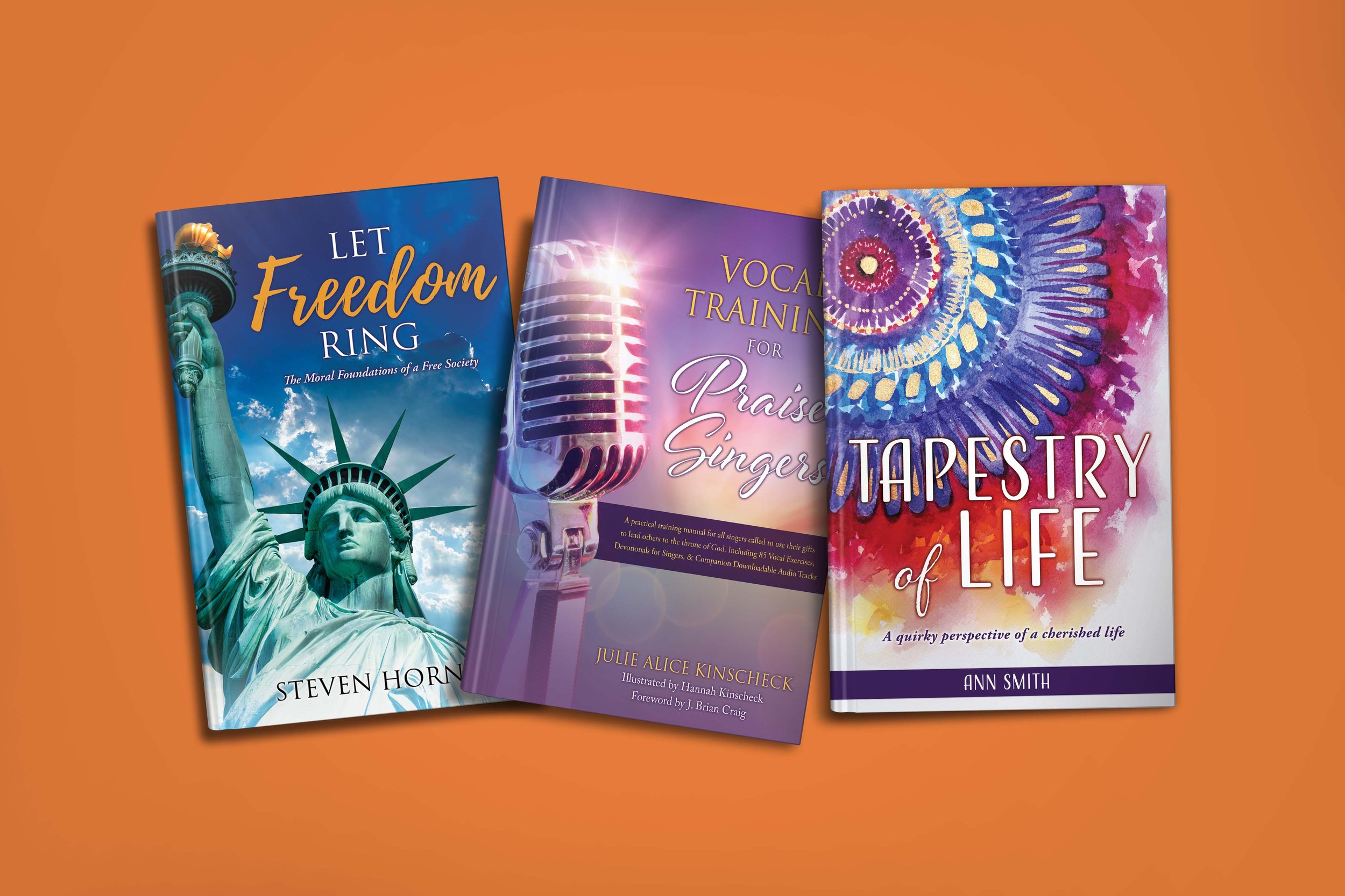
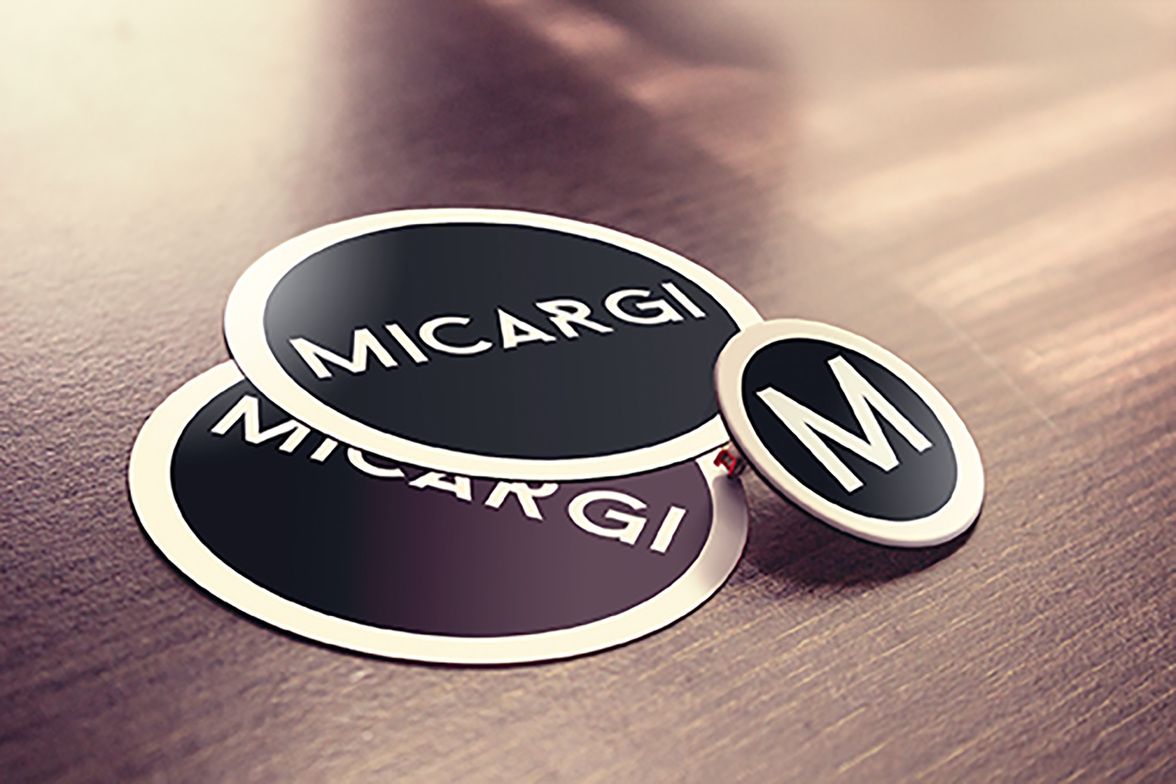
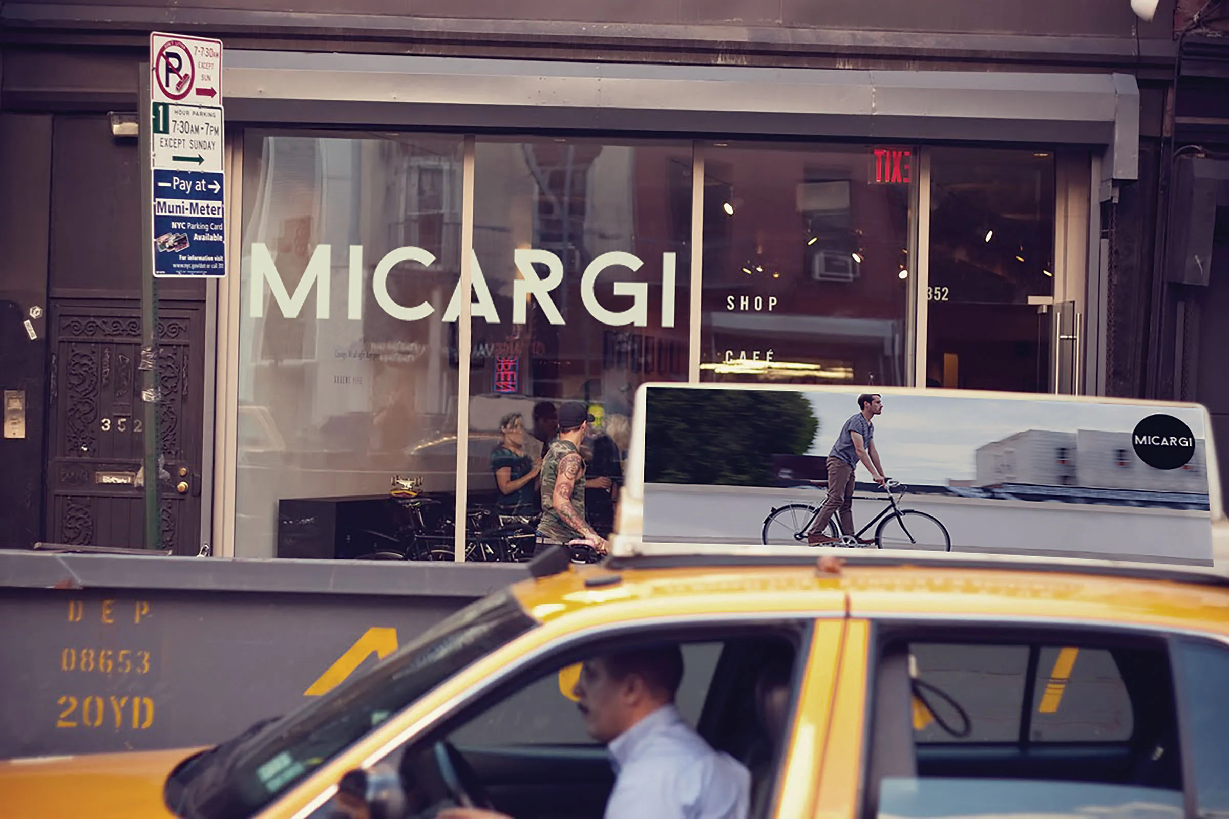
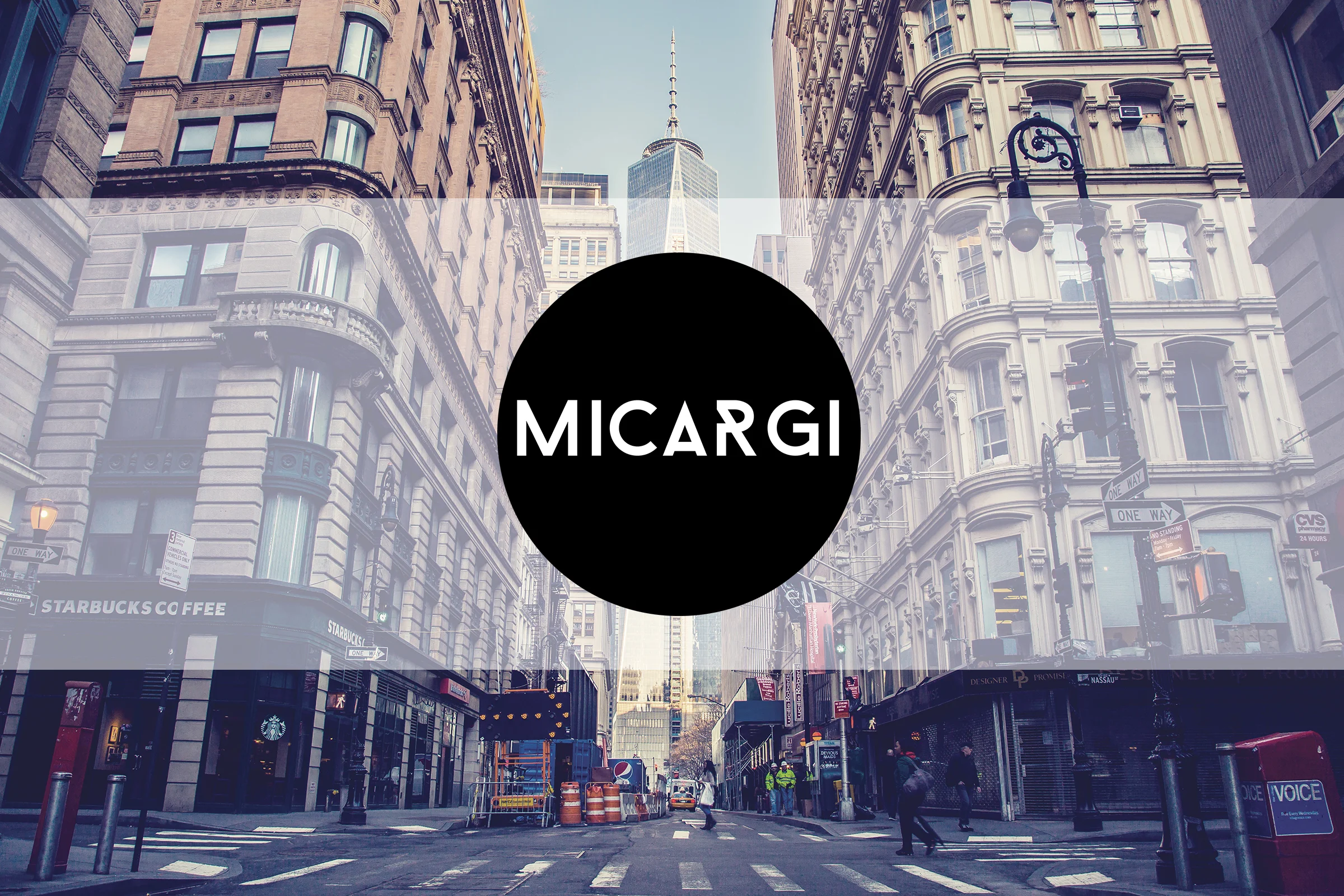
Micargi is an existing company that sells bikes for pretty much all your needs; they have a wide variety of styles for you to choose from. I envisioned Micargi as a bicycle shop located in the heart of New York, that is a bit on the vintage side, but also modern, and focused on hipster as well as elegant fashion. I redesigned Micargi’s logo to fit all those specifications, and then went on from there to showing the kind of bikes, products, and accessories that they might have in their store.
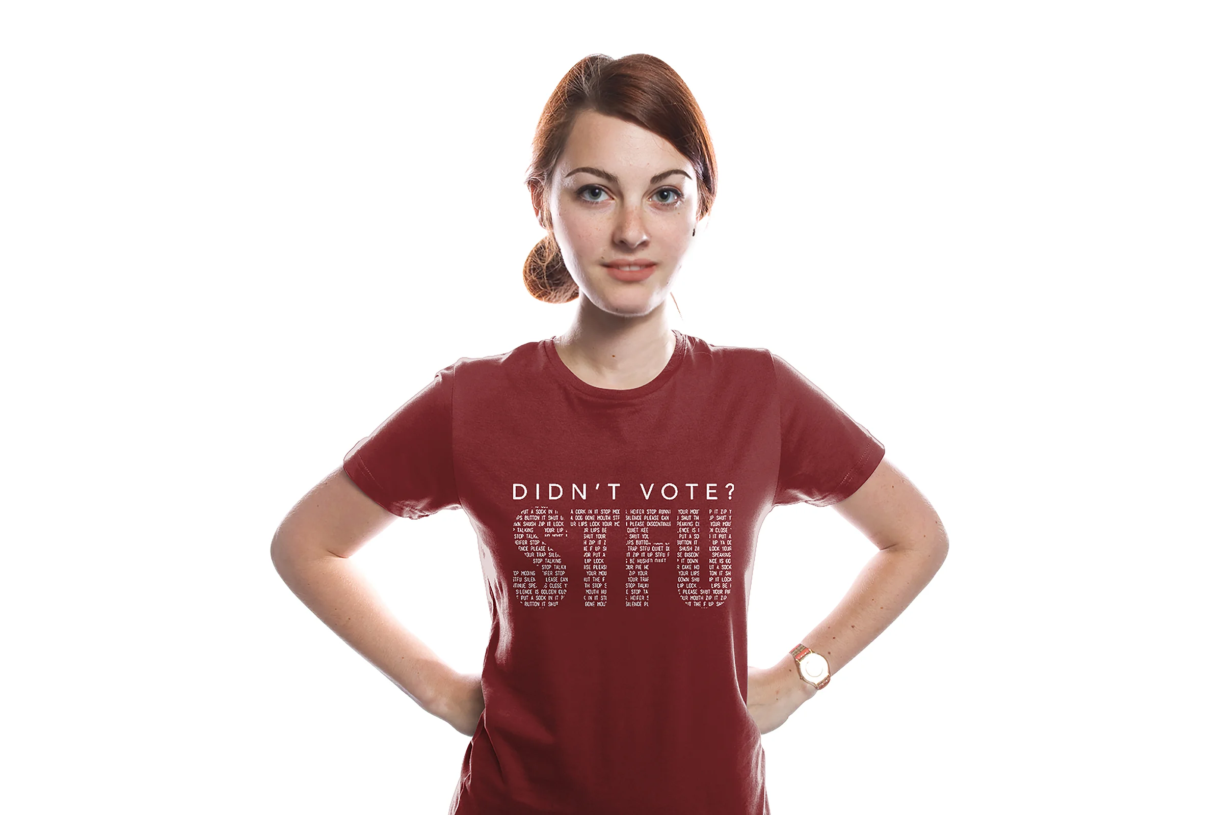
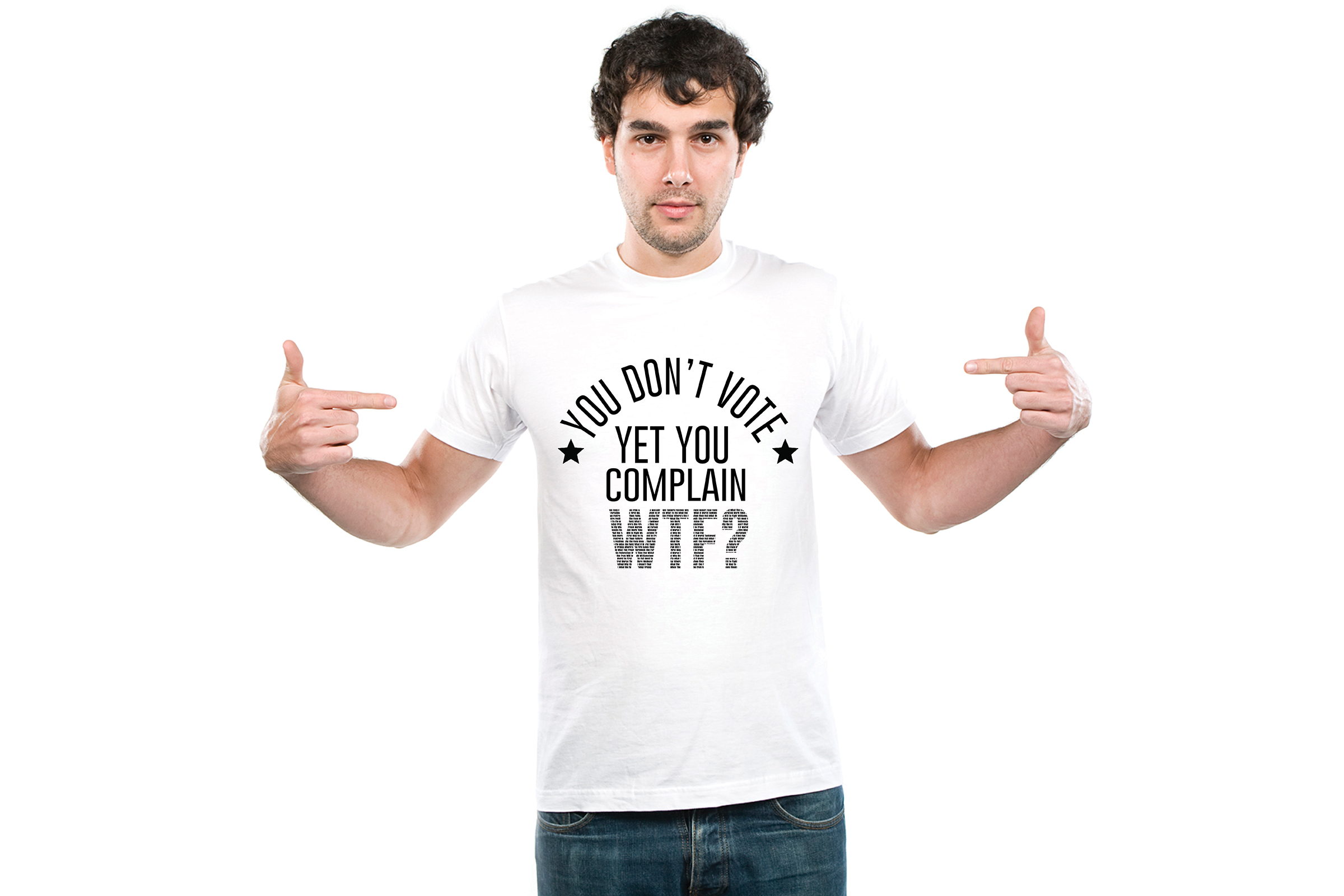
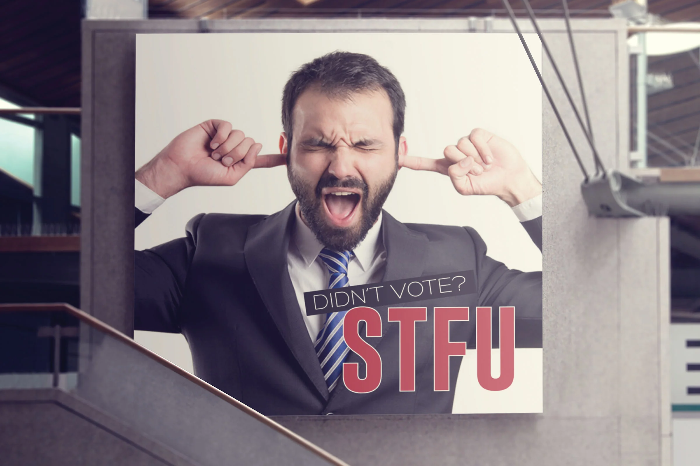
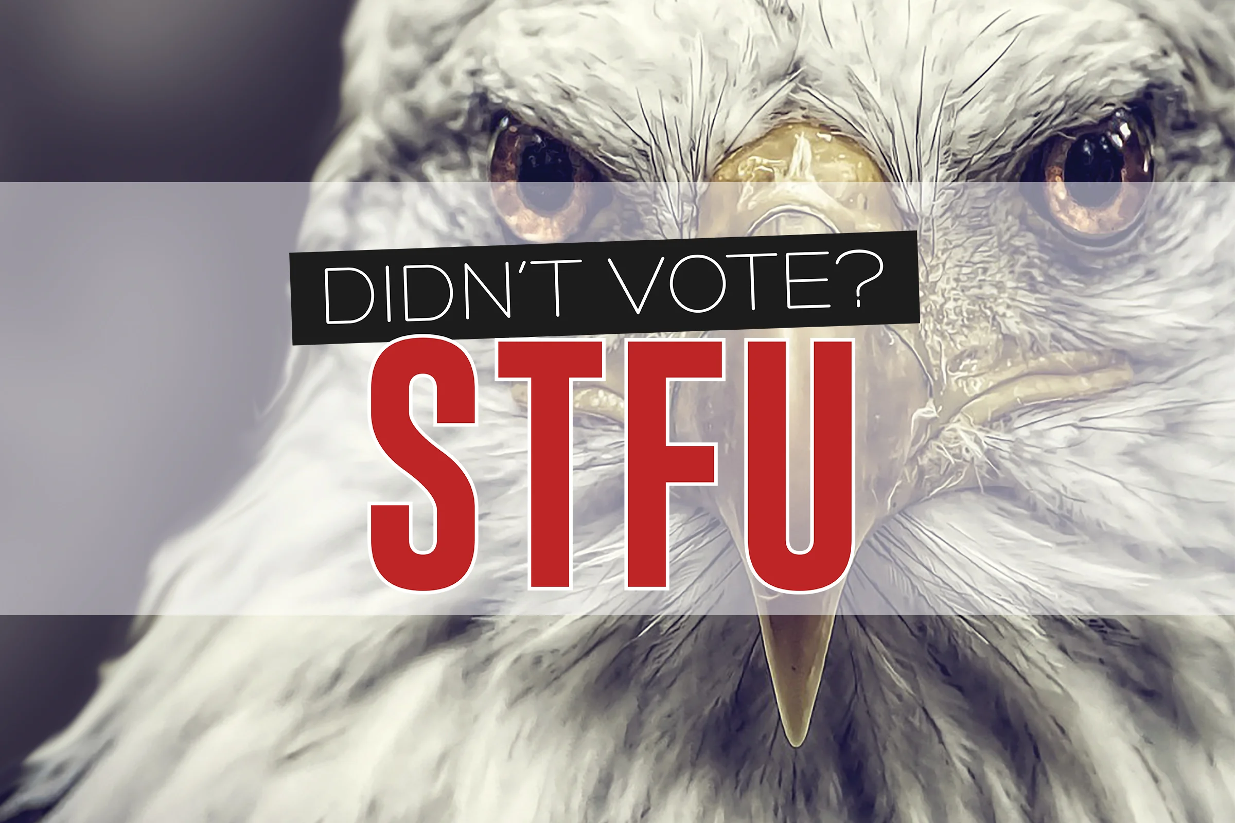
In just a moment, you'll experience one of the most straightforward and outspoken campaigns yet. I took a bold step outside my comfort zone when I was tasked with this project. Though I’m not typically one to swear, I decided to take that liberty when addressing the topic of voting. This campaign is designed to encourage you (in a uniquely unconventional way) to vote for your rights.
The reality is that many Americans don’t vote—whether it's because we feel our vote won’t make a difference or we simply don’t care. Yet, ironically, we often complain when things don’t go right in the country. Sometimes, we need a wake-up call, something to shake us out of our complacency. That’s exactly what this campaign aims to do.
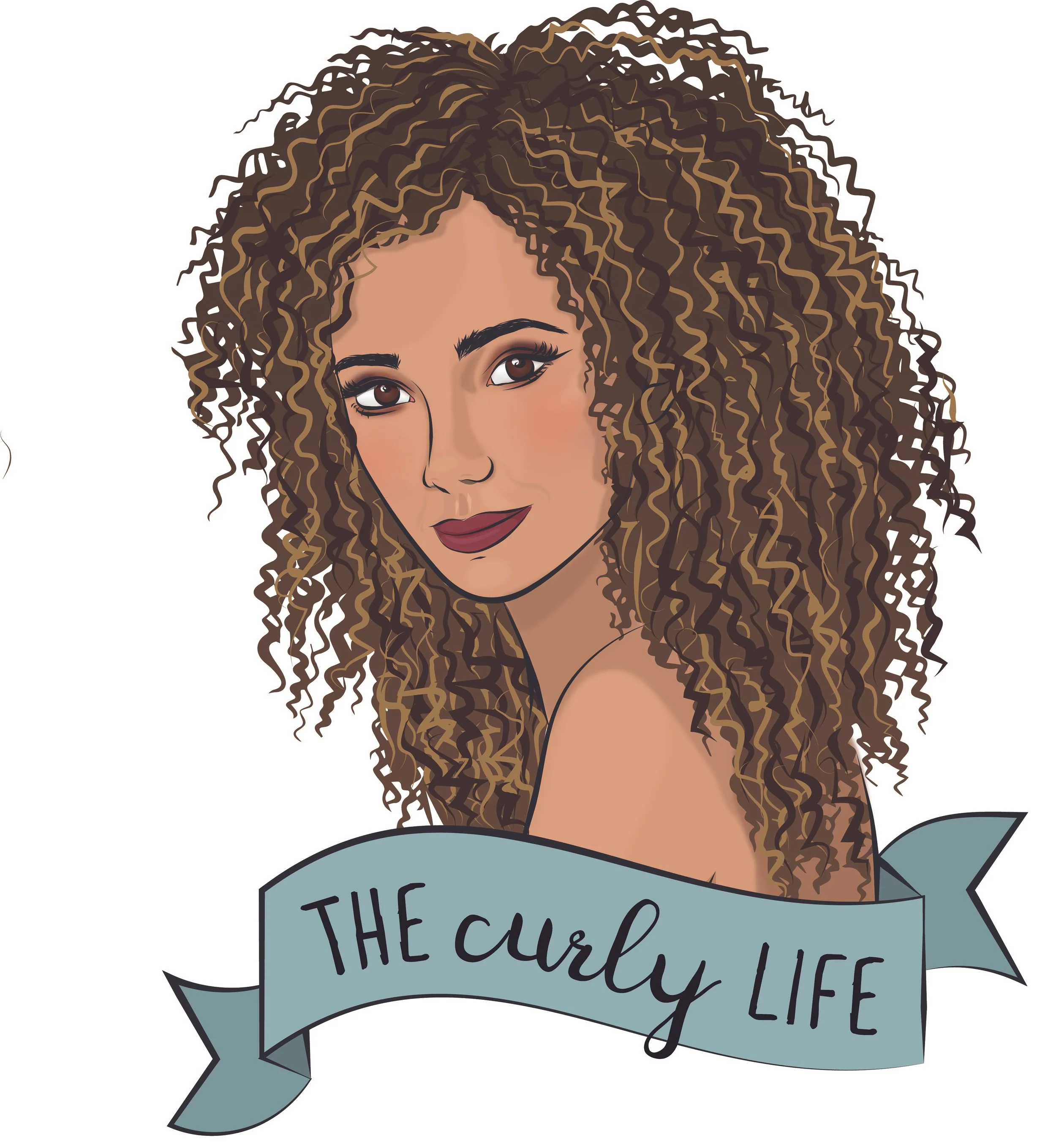
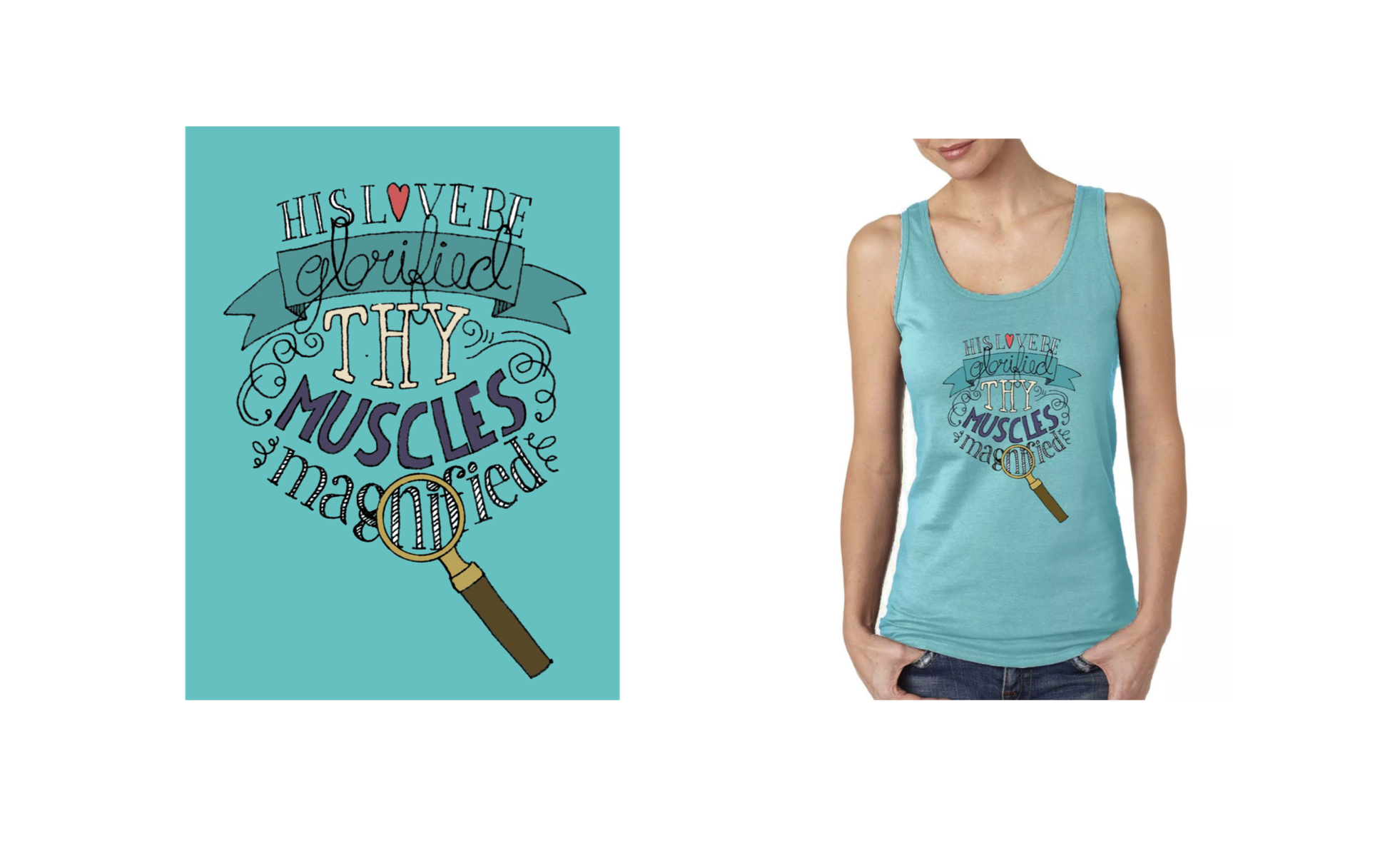
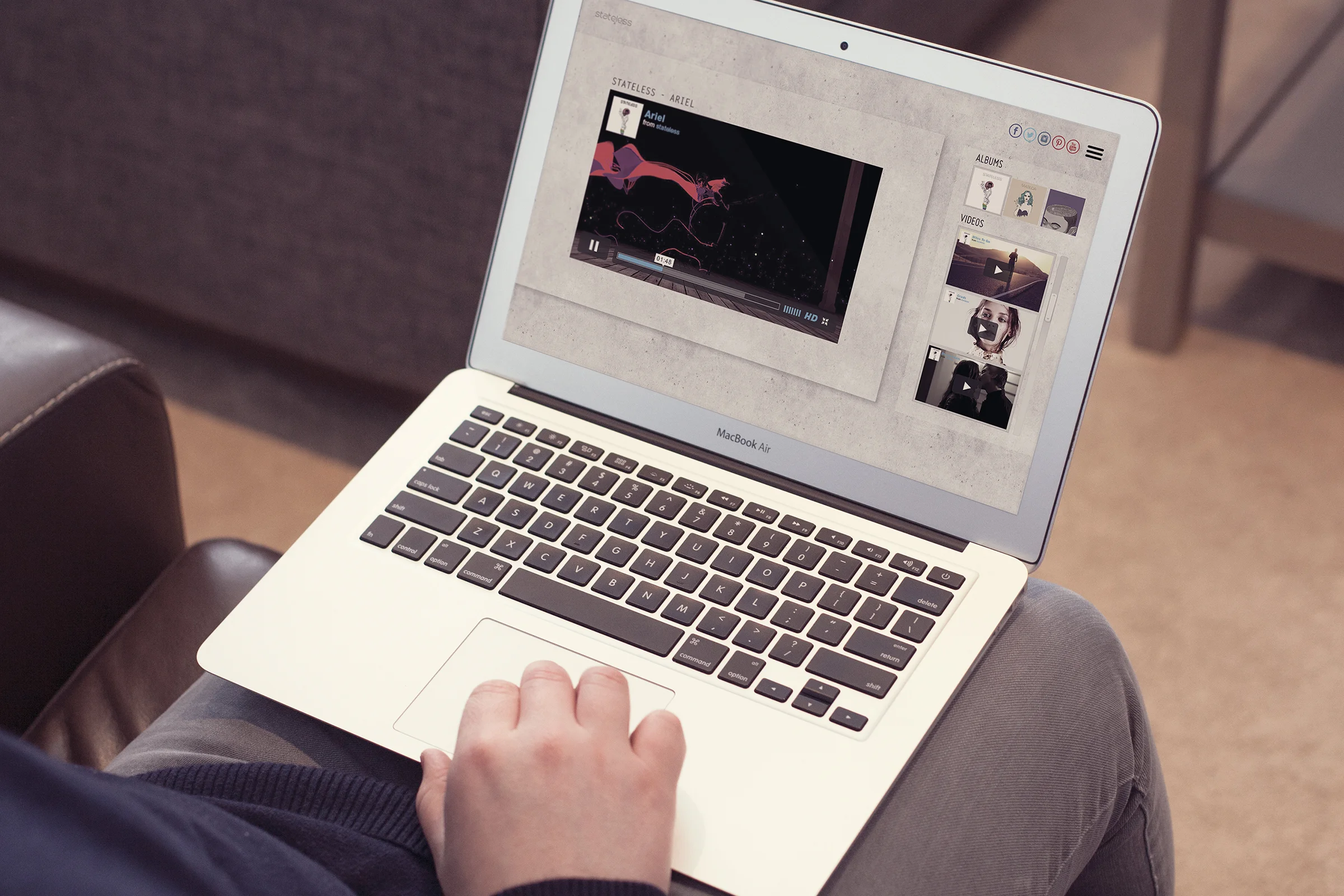
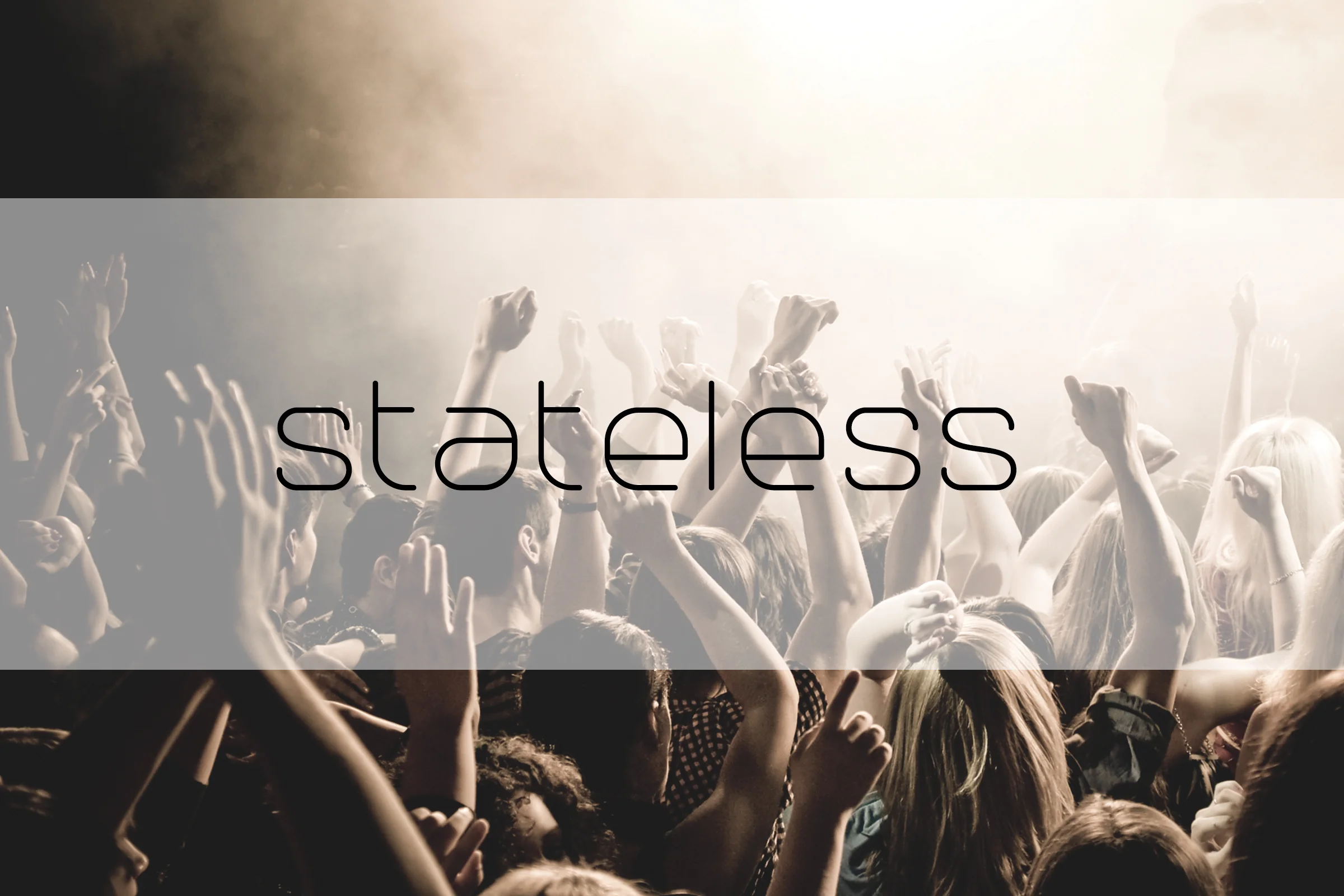
Stateless is one of my favorite bands of all time; hands down. Although I’ll be the first to tell you that they’re not everyone’s cup of tea. Their music genre is trip hop. Yes, the songs on their albums are extremely trippy and make you feel like you’re high. They aren’t mainstream, so you probably won’t hear their songs on the radio (which is one thing I love, since I’m not really fond of “todays music”). While I have found their albums to be amazing, I’m not too crazy on their album cover’s designs. I took it upon myself to recreate their albums, and put to use what many consider to be my God-given talent: illustrating. You’re probably wanting to be the judge of that...so today’s your lucky day! I drew the art on the album covers, and from there I went ahead and designed t-shirts, and carried the illustrations over to their new and improved website. Go and see for yourself! Oh, and I was just kidding about it being your lucky day...I mean, it might be...
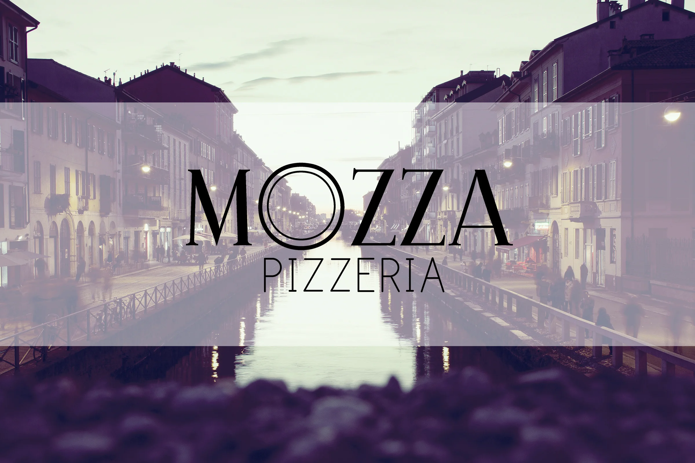
Since the start of this project, my mind was set on the vision of a fancy pizzeria. They say that the best pizza is New York pizza, and since I’m from New York, I can’t really find a reason to disagree with that statement (just saying). I wanted to design a pizzeria that’s just as amazing but different; a high-end but affordable, classy, yet quirky venue that has something for everyone...just in case you’re not all that into pizza. There’s even a food truck roaming around town, for when you need to grab some delicious grub while on the run.
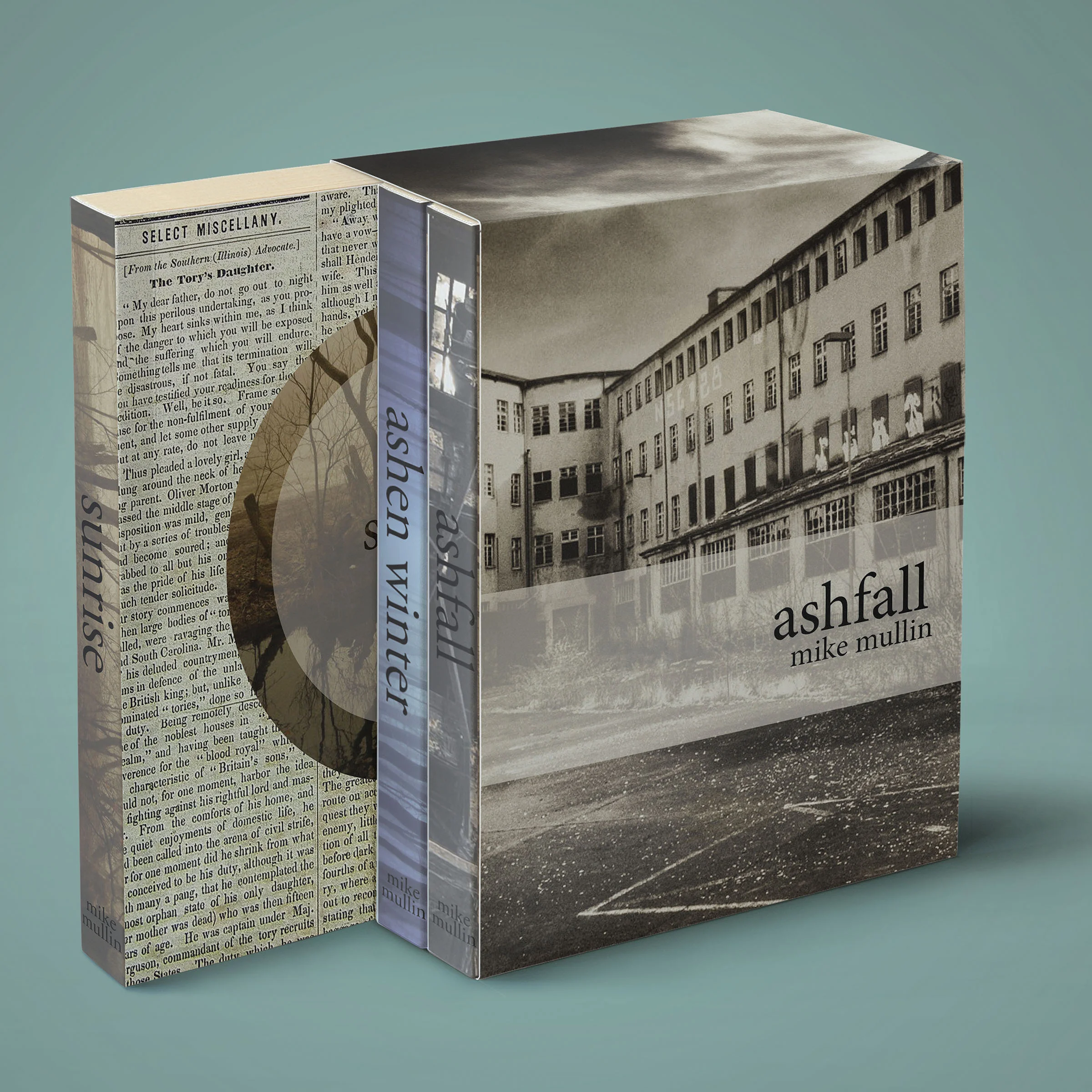
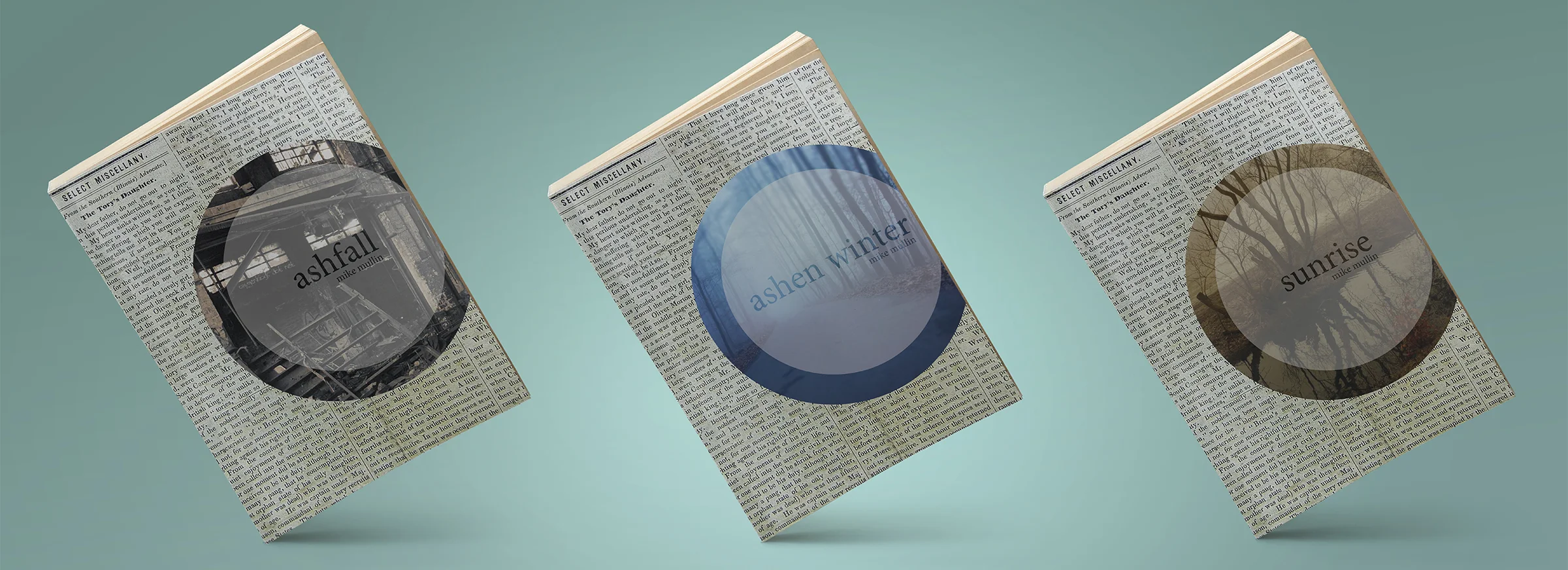
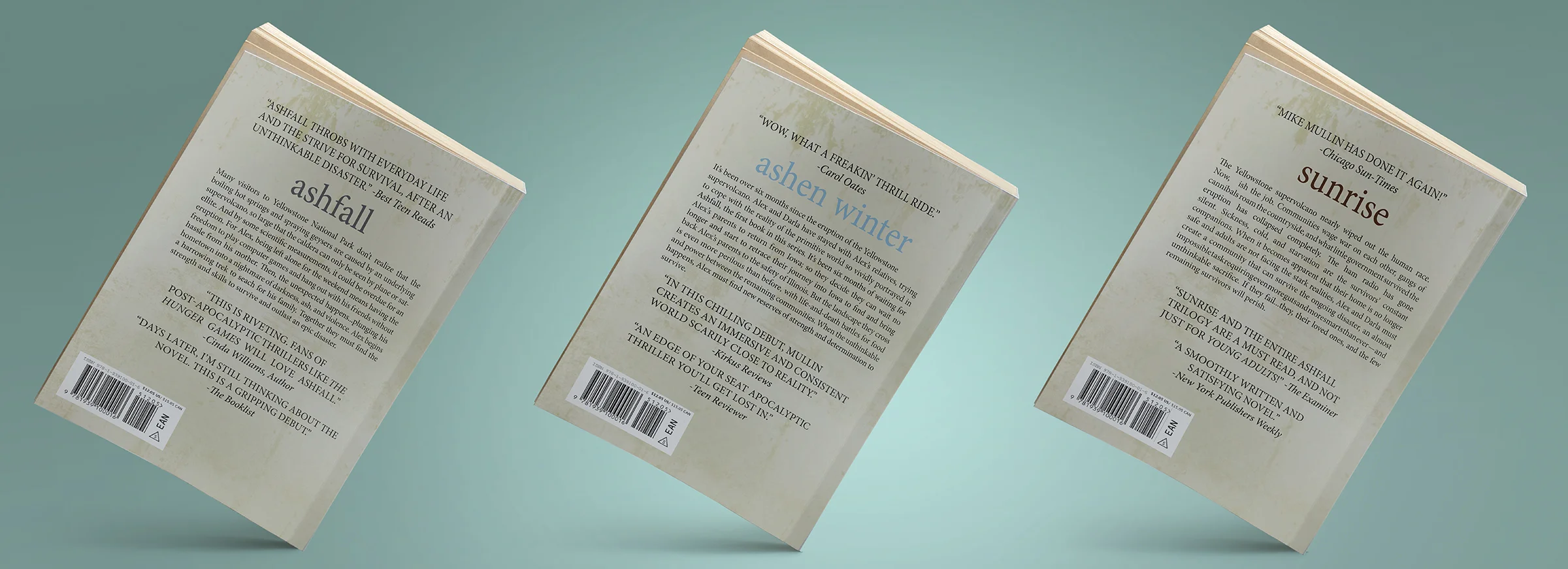
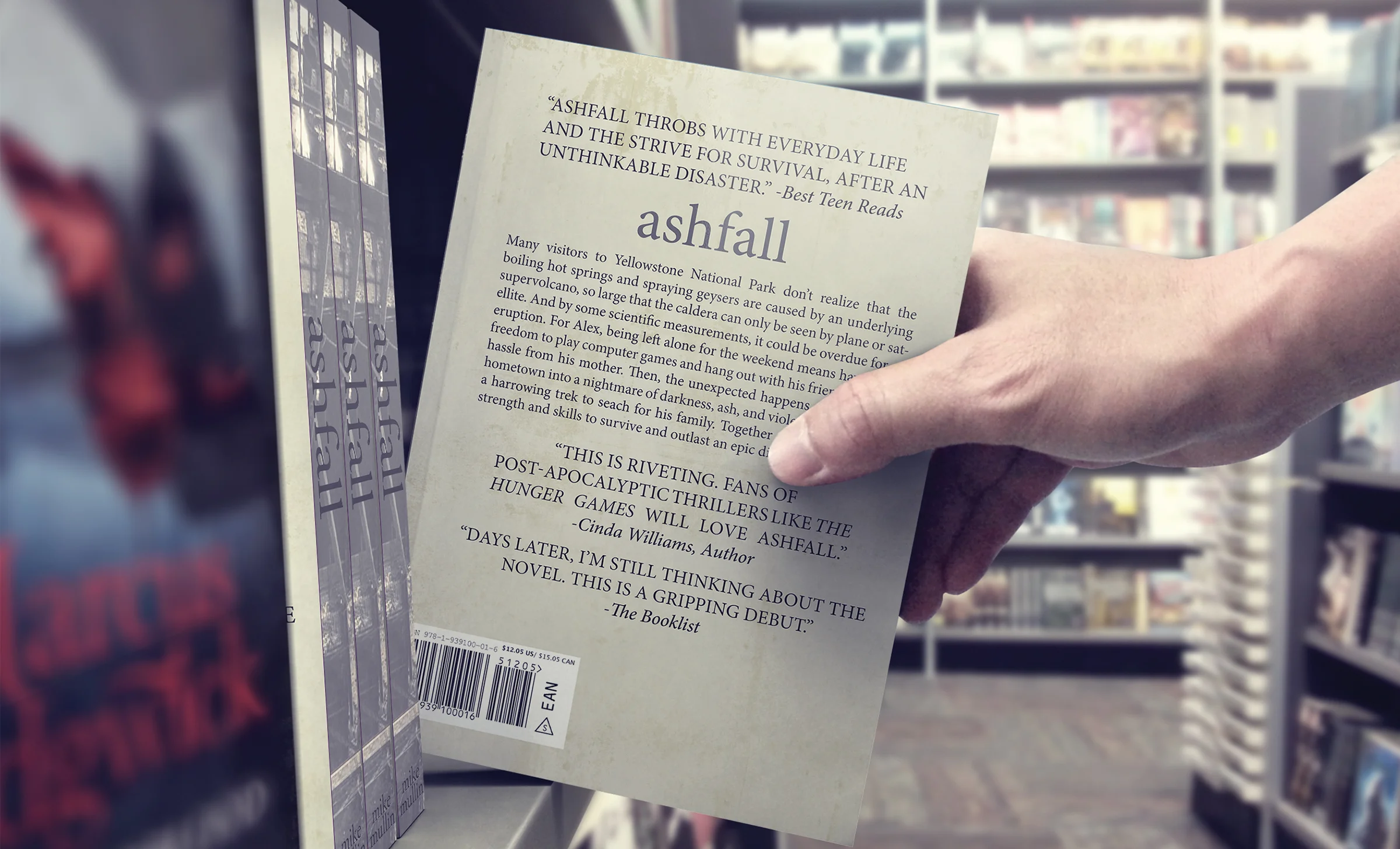
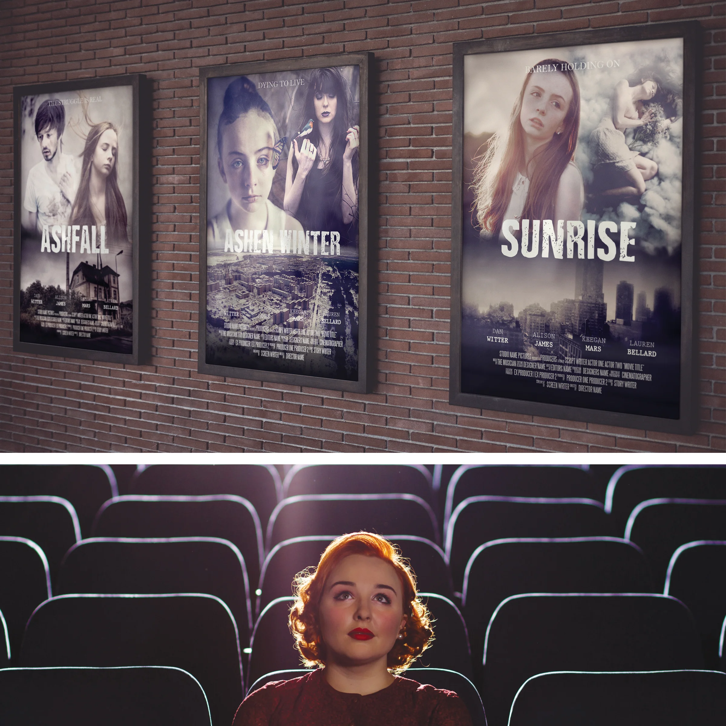
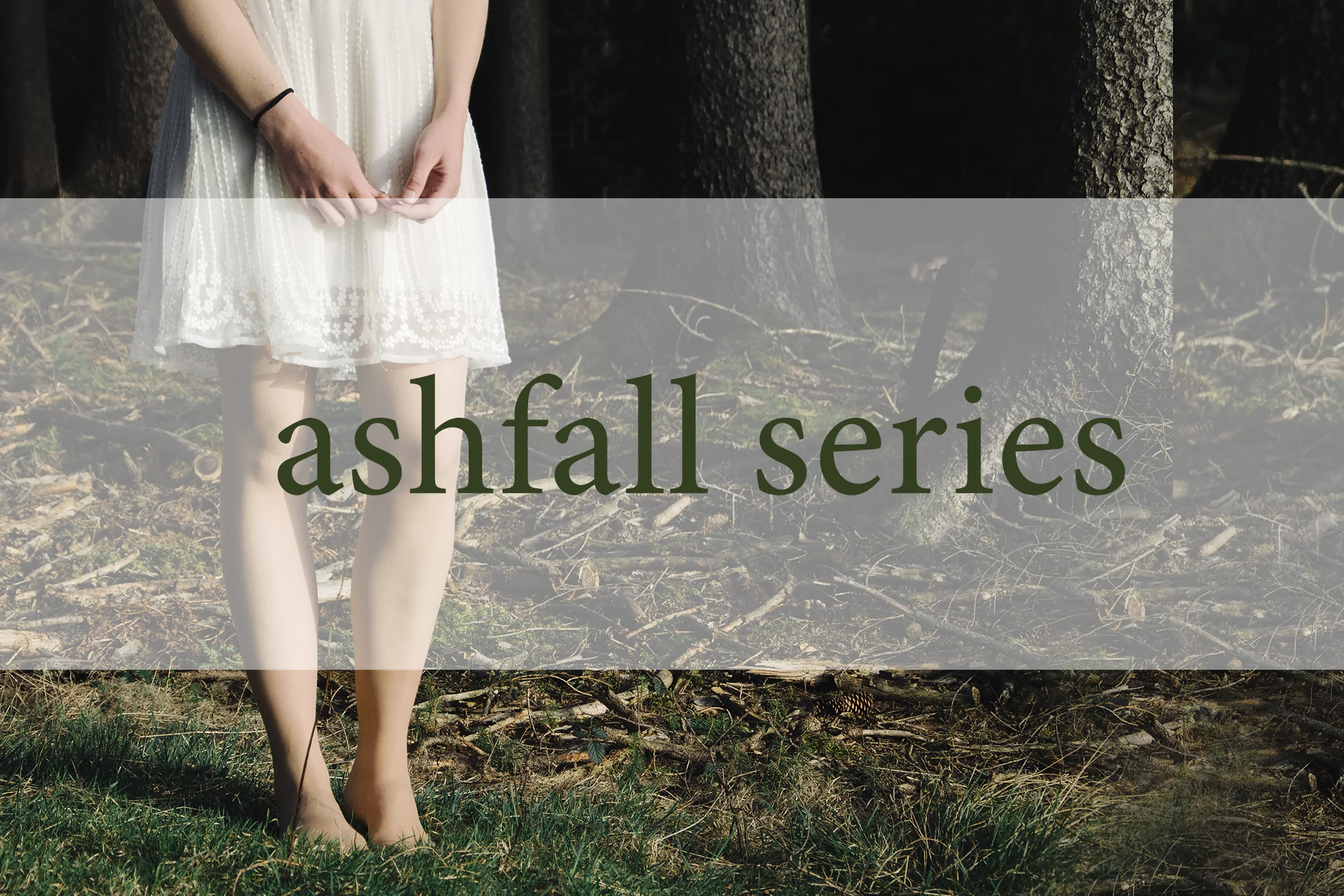
Ashfall is a series consisting of three books: Ashfall, Ashen Winter, and Sunrise. I have read the first two books, but have yet to read the third one. Honestly, I cannot wait to get my hands on a copy of the third book. I must say that if you’re into stories about the end of the world, and the struggle of surviving, you should definitely check out these reads. I thought it would be fun to redesign the book covers, and try to portray the overall sullenly dark vibe that the series casts due to the hardships that the characters face. I also thought about all the movies that have been filmed with storylines from books; I decided to design what I believe the books might look like as movie posters.
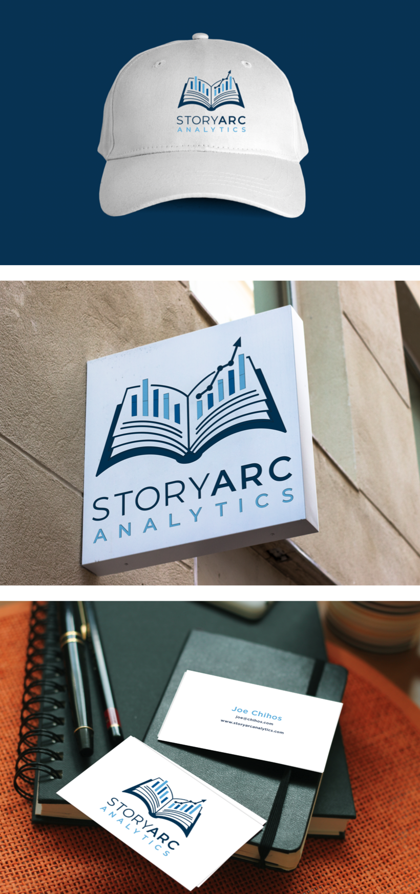
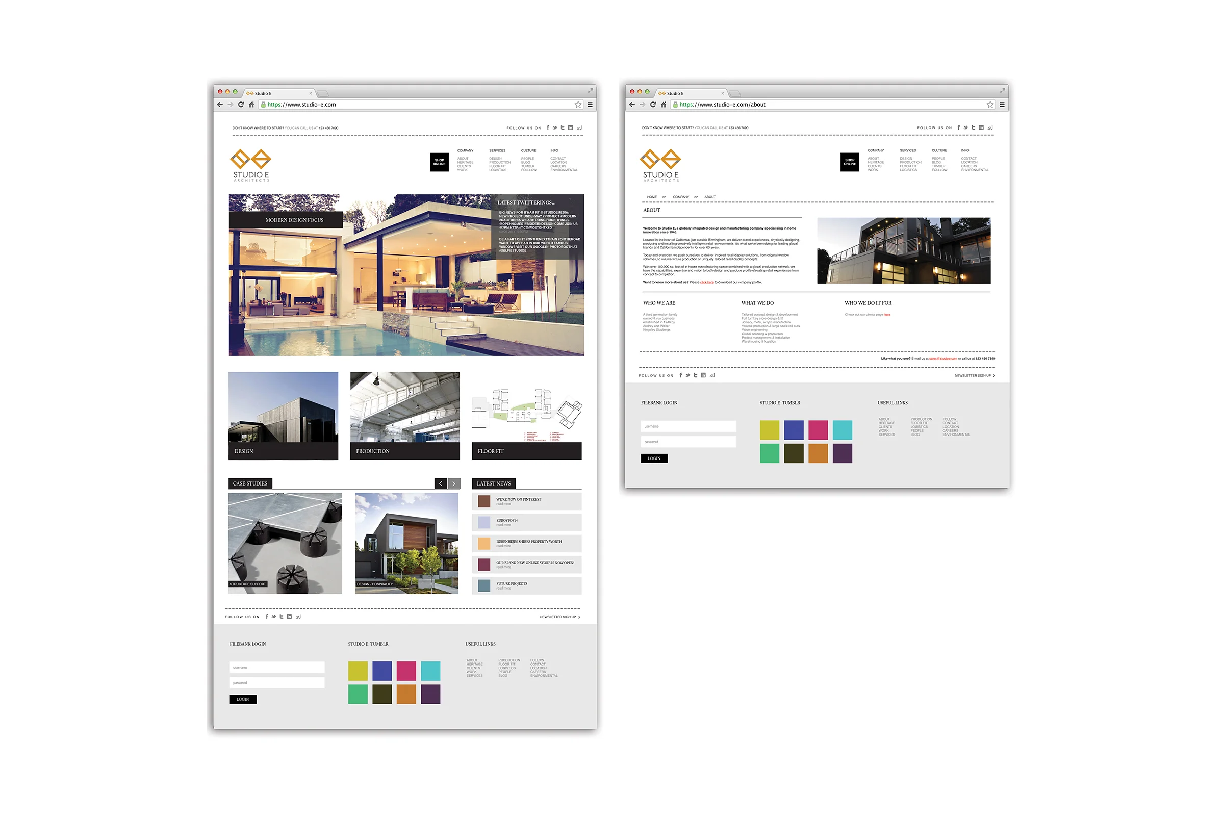
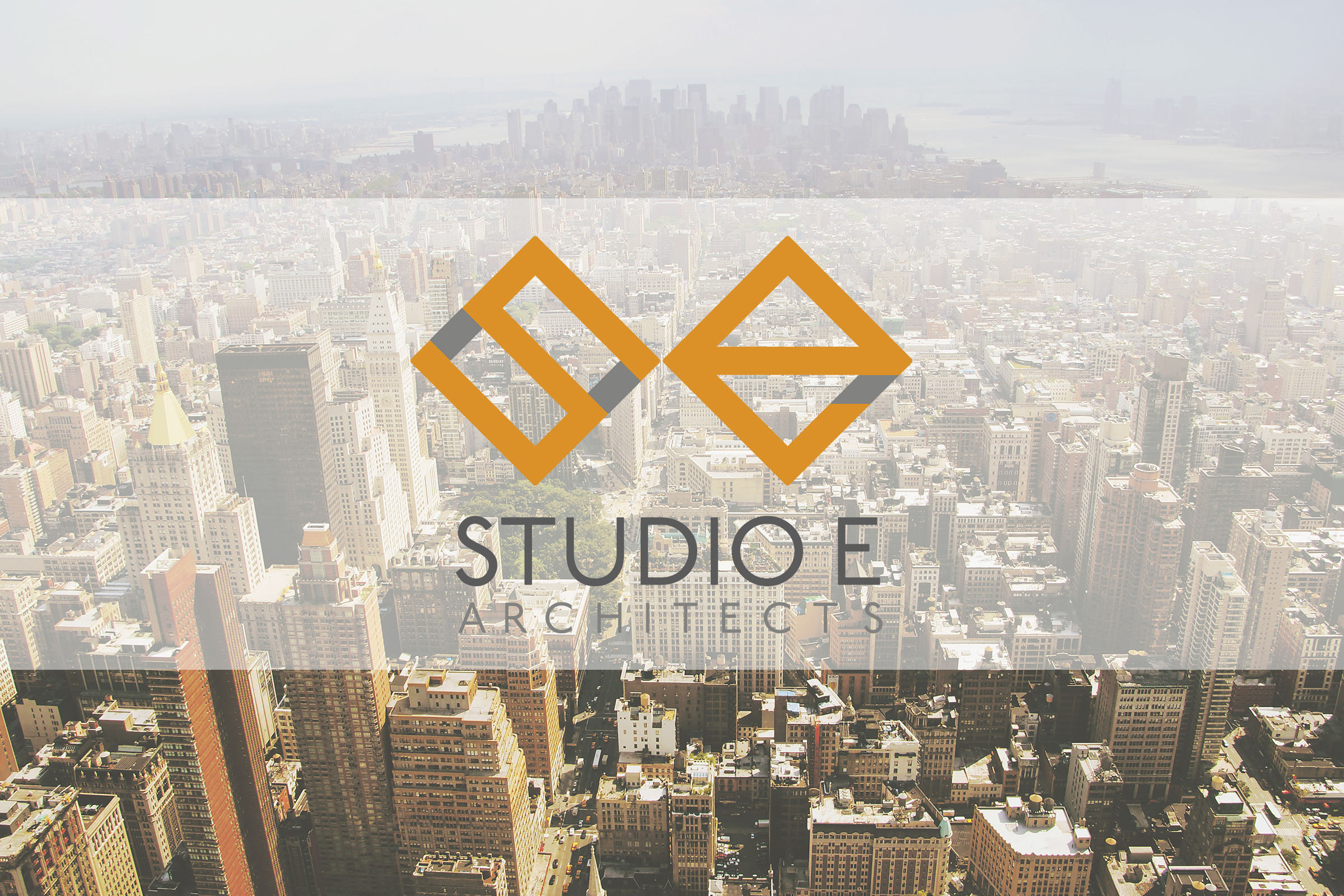
Studio E Architects is a modern architecture company that focuses on minimalistic, and multifunctional design. Their branding wasn’t all that bad to begin with, but I felt like I could improve their image and take it even further. I redesigned their logo to better suit what the company is about, and kept the consistency in their branding; from their stationary to their website, and everything in between. I wanted to emphasize on the overall design of the companies headquarters, simply because “good design starts at home”.
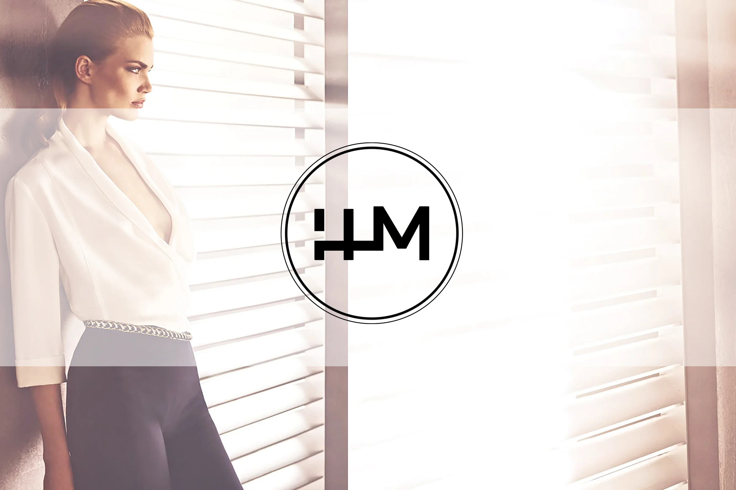
I’m assuming you know about the famous H&M clothing store.
Their clothing changes with the seasons, and their prices are pretty
afforable for those of us who want to “in style” for a reasonable price. I visit H&M at times and I find something I like; but what I don’t really like is their logo. I took this opportunity to come up with a logo that’s much more simple, and appealing to the eye. I wanted to play around with other
possibilities and varieties in clothing and styles. For some reason, I lean towards anything vintage; so in this project, H&M has a vintage collection, as well as elegantly modern apparel; and the clothing tag diciphers between the different collections.
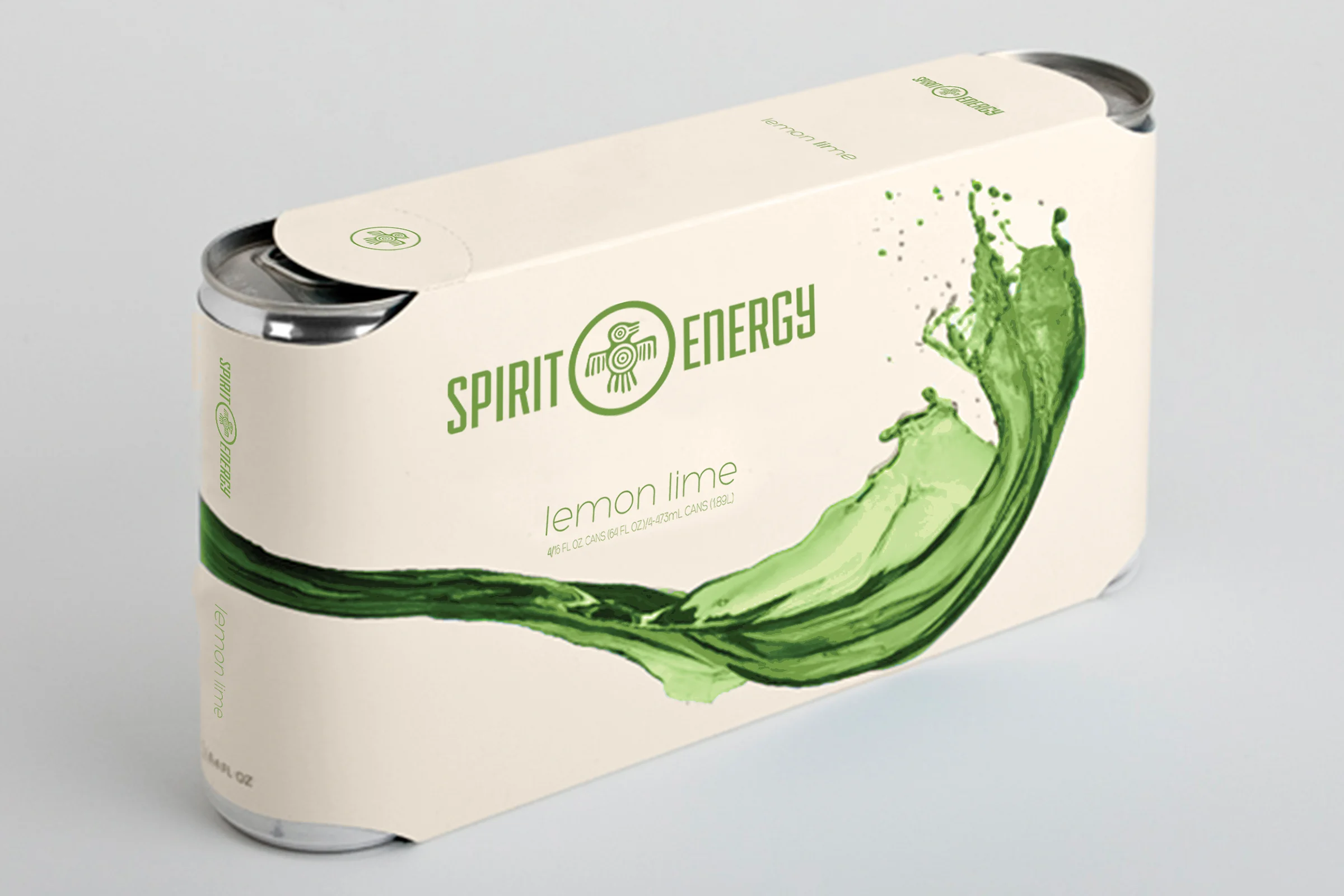
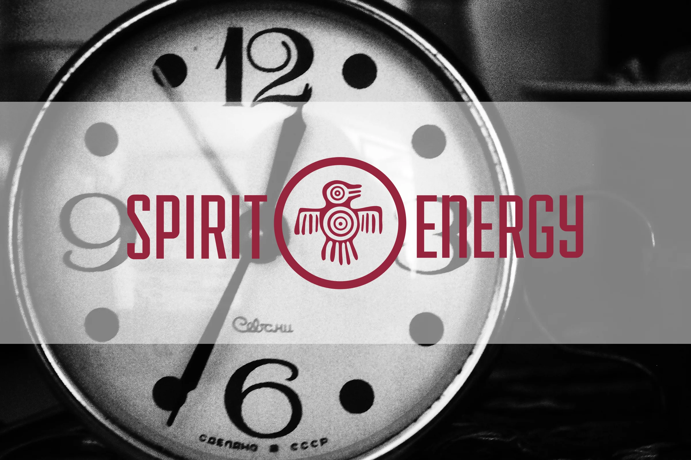
We all know that energy drinks are horrible for your health...no matter how “healthy” a company claims their drink is. But let’s face it...some days it’s really tough to get by without having to chug one of these bad boys down. With that being said, a Spirit Energy drink is organic sparkling water - I know I said that companies try and make their products seem healthy, but Spirit Energy is by far the healthiest poison in the market at the moment. I wanted to go for a simple design, rather than the usual outburst of color used to attract ones attention; especially when it comes to the design of an energy drink label and packaging. You could even go as far as saying that I wanted Spirit Energy’s overall packaging design to appear medicinal; hence the logo. I was set on incorporating the Aztec bird in the logo because it symbolizes power, strength, and courage...and who doesn’t wish to be all those things by simplying drinking this magical fluid?